
A Strategy Dashboard Is…
…A key tool for professionally presenting data! In our first blog on the topic, found here, we discussed the major components of a successful Strategy Dashboard. In this blog, we will go over a few examples of dashboards we use with our clients.
Your company’s executive board, prospective buyers outside your company, and everyone in between will need to see your business’s performance, KPIs (Key Performance Indicators) and total costs in order to know whether or not to invest. Strategy dashboards or “operational dashboards” display your company’s key performance metrics graphically so that, ideally, your audience feels confident in buying into your business.
A dashboard shouldn’t leave out data or massage the truth, but the dashboard also doesn’t need to have everything and the kitchen sink thrown into it.
A successful strategy dashboard does not stuff itself with all data associated with your business. Rather, the dashboard synthesizes the most relevant KPIs into clear, digestible pieces, tailored specifically to the audience to whom you are presenting the figures.
How We Implement Strategy Dashboards
OpenSource Technologies often implements strategy dashboards for clients to make KPIs graphically clear. As every business has different KPIs and metrics for success, every client’s dashboard will be unique. Here are a few examples from our work with valued clients –
TeamPex
TeamPex delivers packages for Amazon.com as a 3PL (Third Party Logistics) Amazon Logistics Business. TeamPex manages multiple delivery stations, 800+ vehicles and approximately 1,500+ employees across multiple states.
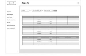
For TeamPex, OpenSource Technologies developed a software to create a dashboard for the internal use of the company. Their dashboard, which appears on the TeamPex web application, neatly displays performance metrics across each station, allowing for the company to quickly determine the performance of each individual delivery station.
These performance metrics include:
- Driver management and wage calculations, with breakdowns of each driver’s assigned route versus how many miles the driver actually drove along with performance and pro activity metrics.
- Vehicle management and maintenance logs, which display the status of the company’s vehicles and the extent to which investment in maintenance is required.
- Advanced reporting including productivity measures per-station and even, if desired, per-driver, hourly delivery updates, percentages of routes completed versus routes planned and percentages of missing deliveries versus all scheduled deliveries.
- Daily and weekly profit-loss figures.
- Upcoming expenses.
NLEQ
National Lift Equipment (NLEQ) is an equipment trading vendor with over thirty years of experience, specializing in selling used and secondhand construction equipment.
For NLEQ, OpenSource developed a custom CRM through which NLEQ can manage equipment, add invoices and new pieces of equipment to the database. The CRM also allows for the easy sending of newsletters or campaigns to leads, clients, and business partners. Included in the custom CRM, OpenSource created a dashboard so that internally NLEQ can see at a glance:
- How many new pieces of equipment they receive in a week, month or year.
- Where trends new leads are coming from, and how their business requirements are shifting.
- How many newsletters and/or mass emails they sent in a week, month or year.
- Who is clicking on and reading the links provided in the newsletters.
- How many invoices they generated within a set period of time.
- What kind and how many new leads they were able to build within a set period of time.
Using this data, NLEQ’s internal teams can better decide their business strategy in the short and long-term.
27th Investment
27th Investment specializes in managing small to mid-size, short-term and long-term, investments across a diverse portfolio. They provide financial solutions to businesses, remaining flexible to each client’s comfort level, risk tolerance, goals and experience with both passive and active investment vehicles.
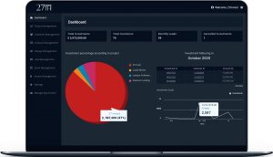
OpenSource developed a dashboard for 27th Investment that encompasses key figures including:
- The sum value of the user’s total investments
- A figure displaying investment maturation
- Ongoing monthly costs
- Canceled investments, including but not limited to:
- Adjustments for amount collected back from each project the cancelled investment is invested in
- Cancellation charges which are automatically deducted
- The prorated interest of the current month, whose total gets sent back to the customer
- Total customers (for internal purposes)
- Monthly leads
- Which can be input manually through 27th Investment’s custom CRM
- Or generated automatically through the mobile app
- Mobile app dashboards (public-facing) through which clients can:
- Track their investments
- Request to invest more in a particular fund or property
- Submit a loan request
The image below displays a sample dashboard:
Let OpenSource Technologies Implement a Strategy Dashboard for You
Because every business measures their performance through different KPIs, each strategy dashboard will look and feel different. However, some common themes may apply across all dashboards, namely: investment versus ROI, which projects are succeeding and which ones are struggling, measures of company engagement and productivity. Depending on how the client responds to the presented data, OpenSource Technologies can also drill down on particular figures, allowing the client to choose what areas of their business they want displayed: both in-depth and at-a-glance.


